The finalized logo on a the website header banner.
The Hillier Book Club was a project I was given to design the logo and brand identity of. It was a long process that went through several revisions but ended up really strong and striking, encouraging our customers to read along with us as well as suggesting various gardening-themed books.
---------------------------------------------------------------------------------
Stage 1 - Concepting
These are some of the very first sketched I did while trying to develop a memorable and striking logo.


---------------------------------------------------------------------------------
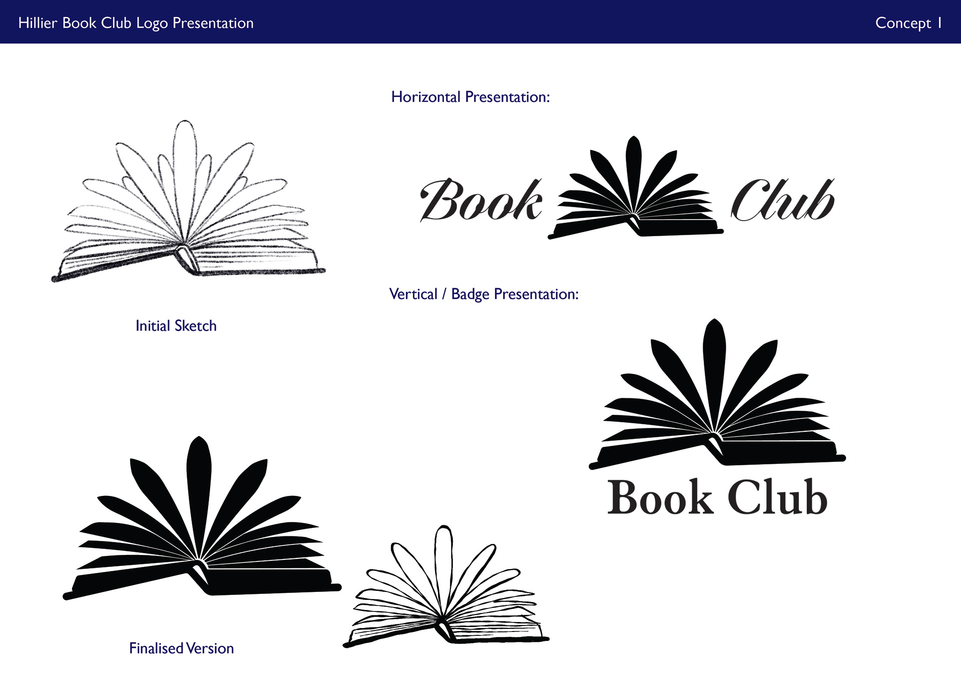
Stage 2 - Presentation
This was where I tested different options for typography as well as how well the logos worked when type was introduced. I fully vectorized my sketches and tried different orientations and presentations.


---------------------------------------------------------------------------------
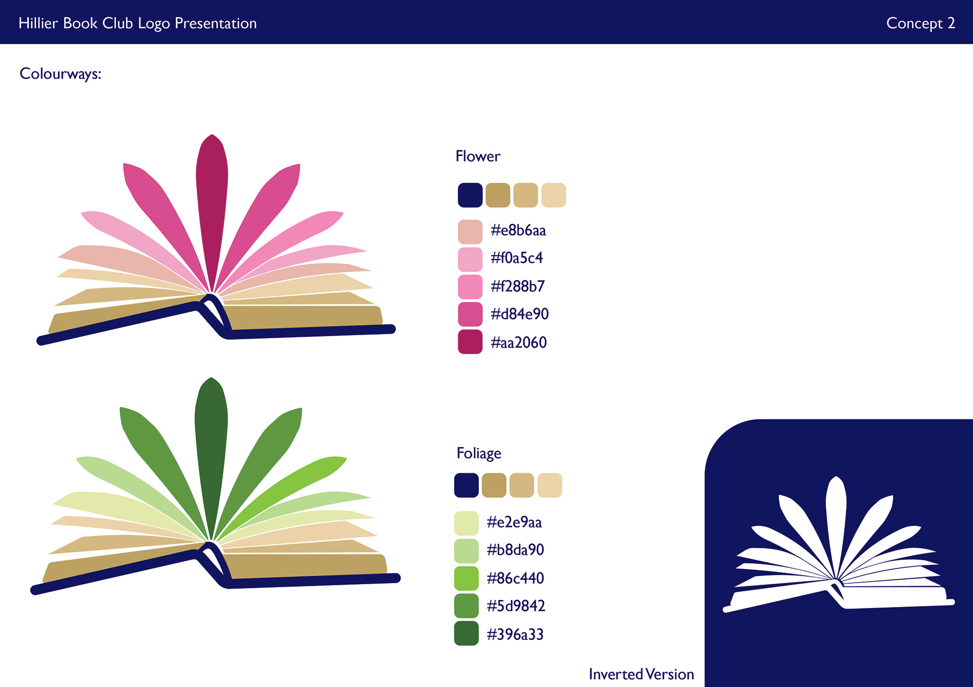
Stage 3 - Colour
This is when I started introducing colour to the logo and seeing how it changed the reception to it. Some were to complicated and others too simple.


---------------------------------------------------------------------------------
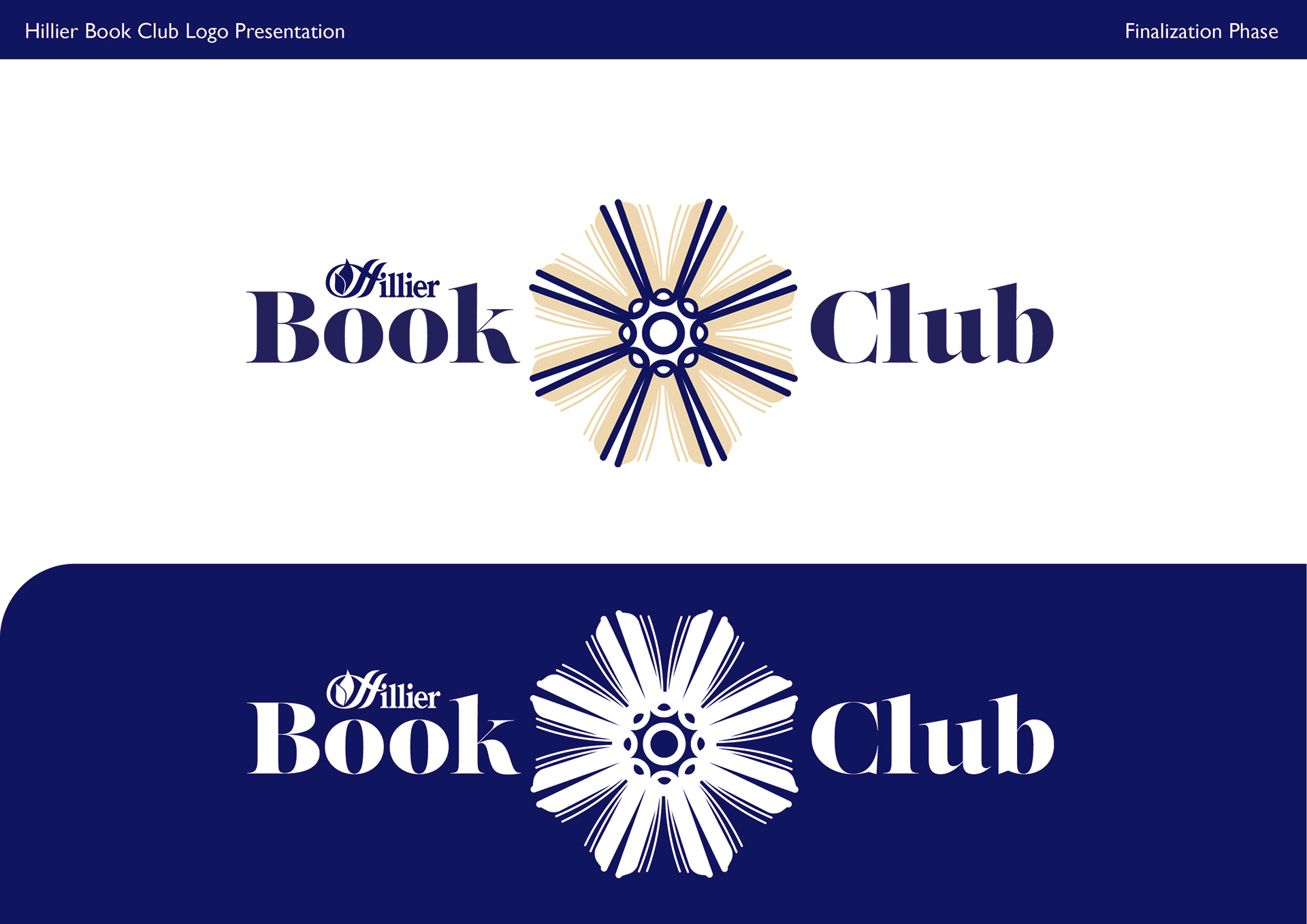
Stage 4 - Decision
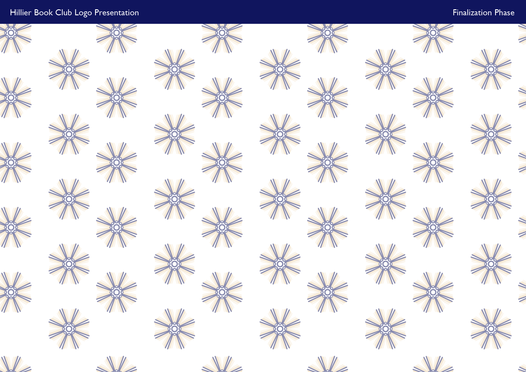
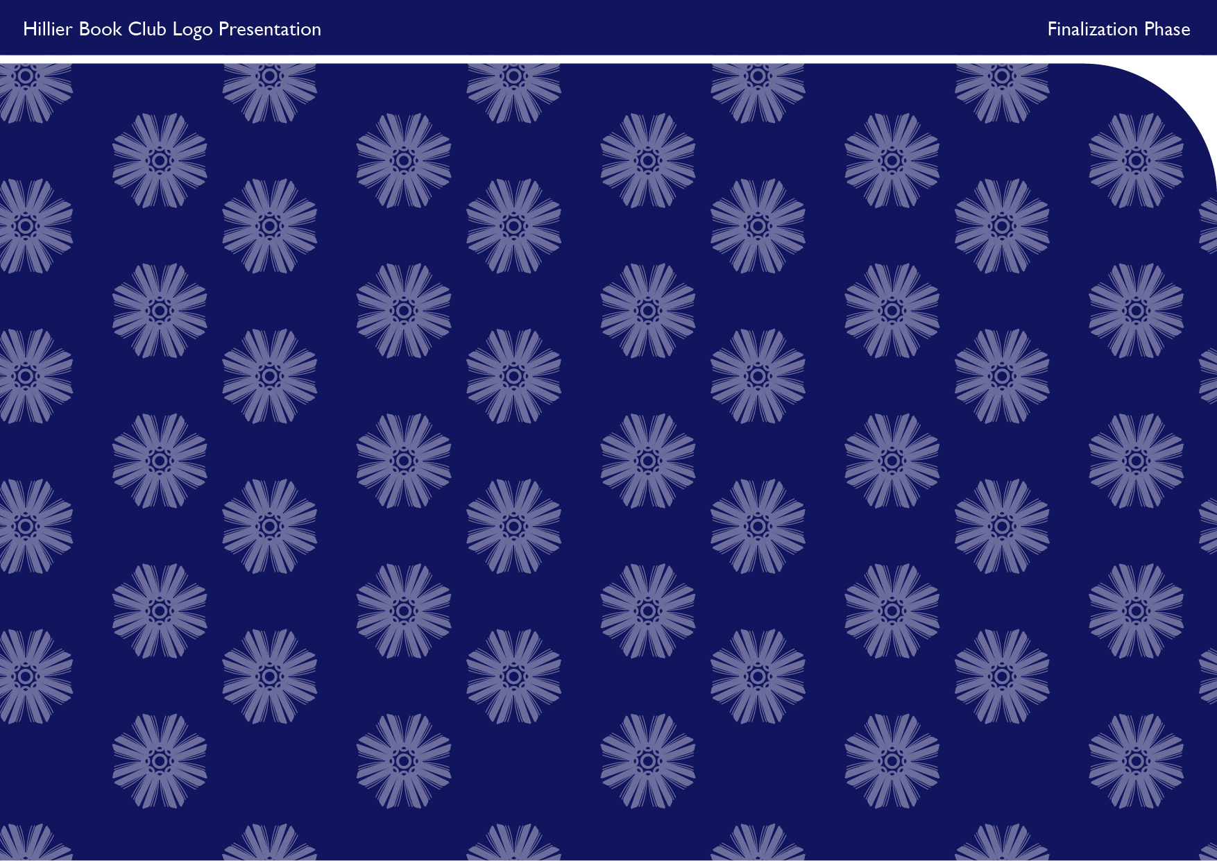
Once one of the logos was selected, I played around with the finalizations on detail and sizing as well as deciding on the typeface we would use. Once that was finalized, I finished off the project by creating a pattern to use as well as the banner to introduce the page on the website.